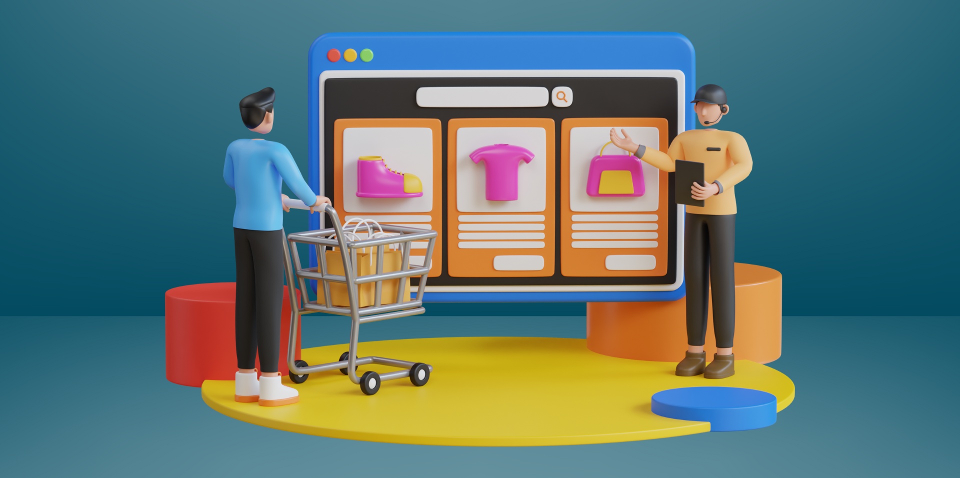
A well-designed e-commerce website is the foundation of a successful online business. However, many companies have websites with design mistakes that lead to high bounce rates and lost sales. From poor navigation and search functionality to an overly complicated checkout process, these issues can frustrate customers and drive them to competitors.
To maximise conversions and enhance user experience, e-commerce stores must be fast, intuitive, secure, and optimised for SEO and mobile devices. In this guide, we will outline six significant mistakes in e-commerce site design that could adversely affect your sales, and how to avoid them.
If your e-commerce site isn’t performing well, our team at britweb can assist you. Whether you require a brand-new online store or enhancements to your existing site, we specialise in web development and digital marketing to help you attract traffic and increase conversions.
Call us today on 01403 2614911 or complete our contact form. We look forward to hearing from you.
1. Poor site navigation
A complicated navigation system makes it difficult for potential customers to find what they need, leading to frustration and site abandonment. If your menu is cluttered, lacks structure, or requires too many clicks, users may leave for a competitor’s site.
Common issues:
- Too many or unclear categories – Overwhelms visitors instead of guiding them.
- No search bar or limited filtering options – Makes finding specific products harder.
- Lack of breadcrumb navigation – Users can’t quickly backtrack to previous pages.
- Inconsistent menu placement – Confuses returning customers.
Updating to have a well-organised and consistent menu placement across all pages will help ensure accessibility and create a smoother shopping experience, making it easier for customers to find and purchase products.
2. Ineffective search functionality
A poorly designed search function frustrates customers and results in poor user experience and lost sales, as many shoppers depend on it to find products quickly. If the search bar is difficult to locate, provides irrelevant results, or lacks filtering options, users may leave your site for a competitor with a more intuitive system.
Common issues:
- Hidden or difficult-to-use search bar – Customers struggle to locate it.
- Irrelevant or no search results – Poor algorithms fail to match user intent.
- No auto-suggestions or typo tolerance – Small errors return no results.
- Limited filtering and sorting options – Users can’t refine searches efficiently.
To improve search functionality, ensure your search bar is easily visible, supports auto-suggestions and typo correction, and uses smart search algorithms to prevent “no results found” errors. A fast, intuitive search function will improve the shopping experience and work to increase overall conversions.
3. No clear call-to-action buttons
A lack of clear call-to-action (CTA) buttons can confuse customers and reduce conversions. If users don’t know where to click to add products to their basket, proceed to checkout, or sign up for offers, they may leave without completing a purchase.
Common issues:
- Unclear or generic CTAs – Vague terms like “click here” instead of specific actions.
- Poor visibility – Buttons blend into the design instead of standing out.
- Too many CTAs on one page – Overwhelms users and creates confusion.
- Inconsistent placement – CTAs are not positioned where users expect them.
Well-designed CTAs guide shoppers through the buying process, improving user experience (UX) and encouraging them to take action. Ensure strategic placement above the fold and the text is clear and compelling across multiple devices, including for mobile users and different screen sizes.

4. Complicated checkout process
A lengthy or complicated checkout process is one of the primary reasons for cart abandonment. If customers face too many steps, unexpected charges, or limited payment options, they might leave without finalising their purchase.
Common issues:
- Requiring account creation – Forcing users to sign up instead of allowing guest checkout.
- Too many form fields – Asking for excessive details slows down the process.
- Lack of multiple payment options – Limiting choices can frustrate customers.
- No progress indicator – Users don’t know how many steps remain.
You can simplify the checkout process by offering a guest checkout option and requesting only essential information. Streamlined and user-friendly checkout pages will enhance customers’ shopping experience and increase conversion rates for e-commerce businesses.
5. Lack of trust signals and security measures
Customers who do not perceive your e-commerce site as secure and trustworthy will be reluctant to enter their payment details, resulting in lost sales. Shoppers require reassurance that their personal information is protected and that your store is legitimate.
Common issues:
- No SSL certificate (HTTPS) – A lack of encryption makes your site look unsafe.
- Missing customer reviews – Without social proof, shoppers may doubt product quality.
- Unclear return and refund policies – Uncertainty about returns discourages purchases.
- Lack of visible contact details – No phone number or support chat raises concerns.
Displaying trust signals will bolster your website’s credibility and enable users to make purchases confidently. Ensure you possess an SSL certificate, emphasise customer reviews, clarify return policies, and make sure that customers can easily reach you with queries or concerns.
6. Ineffective product page layouts
Your product pages need to engage customers and drive sales. If key elements like detailed descriptions, high-quality images, and trust signals are missing, potential buyers may hesitate and abandon their purchase.
Common issues:
- Low-quality or insufficient product images – Customers can’t see the product clearly.
- Thin or generic product descriptions – Fails to highlight key features and benefits.
- No customer reviews – Lacks credibility and social proof.
- Missing stock or shipping details – Causes uncertainty about availability and delivery times.
Enhance product pages by using clear, high-resolution images, writing detailed and SEO-optimised descriptions for your target audience, and showcasing customer reviews to build trust and boost sales. A well-optimised product page will build credibility, reduce uncertainty, and encourage conversions.
Build a successful e-commerce site with britweb
A well-designed e-commerce site is essential for driving sales and providing a seamless user experience, but avoiding common design mistakes is just the first step. At britweb, we specialise in professional web design that ensures your online store is fast, intuitive, and offers a user-friendly experience, whilst our SEO services will help boost your website’s visibility in search engines and organic traffic.
Whether you need a brand-new e-commerce site or improvements to your existing one, our team can create a solution tailored to your business goals. Contact britweb today to take your e-commerce website to the next level.